A palette that looks coordinated on a phone can feel unexpectedly different when paper, fabric and flowers meet in the reception room. Rather than searching for a supposedly perfect colour code, test a small group of physical samples under the lighting your guests will actually encounter.
Colour-management company X-Rite explains metamerism: two colours can appear to match under one light source but not another. That does not mean every mismatch has that cause, or that a couple needs laboratory equipment. It means a daylight-only comparison is not enough when dinner will take place under different lighting.
🎨 Assemble a useful sample kit
Begin with repeatable manufactured materials: the actual linen sample, production paper, printed lettering and a vessel or metal finish. Label the product reference, finish and batch where known. This is approval of the room’s non-living materials, not a promise that flowers will match a manufactured swatch. A tiny digital thumbnail cannot show texture, sheen or the way transparent materials overlap.
- Confirm a venue visit that includes the intended reception lighting.
- Place samples together on a surface similar to the real table.
- View them in daylight and in the agreed evening setting.
- Look from seated distance as well as close up.
- Record a decision beside each combination: keep, adjust or retest.
- Approve a physical reference sample before committing to a large order.
Ask permission before changing any venue lighting. Staff should operate their systems, and specialist lighting work belongs to the supplier. If the final fixtures are not installed yet, record that limitation rather than treating an improvised lamp as an exact preview.
A worked three-material decision
Assume an illustrative palette of ivory linen, muted green stationery and brushed-metal vessels. In daylight the paper and linen feel harmonious, but under the venue’s dinner lighting the paper looks much greyer than intended. No real test has been performed here; this is a hypothetical decision exercise.
| Combination | Observation to record | Possible decision |
|---|---|---|
| Ivory linen and green paper | Paper loses distinction in evening setting | Try deeper green text or different paper |
| Brushed-metal vessel and ivory linen | Finish reflects nearby colours differently from its catalogue image | Approve the actual finish, not a digital substitute |
| Metallic lettering and pale card | Reflection obscures words from one angle | Use a non-reflective text treatment |
The decision is not necessarily to replace the entire palette. You might keep the linen and vessels while changing only the text colour. That protects the visual relationship without making every object an exact match.
Separate colour approval from readability
A place card can be beautiful and difficult to read. Check the actual lettering, background and finish, not just a blank swatch. Decorative colour decisions should not remove the practical contrast needed for names, directions or menu information.
Photograph the arrangement for reference, but also write what you saw. Camera processing, exposure and display settings can alter the appearance. A photograph is useful for remembering placement, not a guarantee of how another supplier’s material will look.
Give suppliers the approved physical reference where practical and agree how substitutions will be handled. Natural materials vary, and separate manufacturing batches can differ. Ask which aspects can be controlled and which require an acceptable range rather than an exact promise.
Make the final order proportionate
Do not order the full stationery suite simply because a home printer sample looked acceptable. Ask for the production material and printing method you will actually receive, or understand the uncertainty if a proof cannot be supplied.
Keep an approval record with material reference, lighting setting, observed readability, decision, approver and date. If a linen or stock is substituted, ask whether that specific combination needs another check. For living materials, use the separate flower-colour variation and substitution approval guide; it defines what the florist may vary rather than repeating this manufactured-material test.
This exercise cannot reproduce every hour, weather condition or guest viewpoint. Its useful takeaway is a documented palette decision based on real materials in relevant light, with readable information and an agreed tolerance for variation.
Sources and further reading
Photograph credit
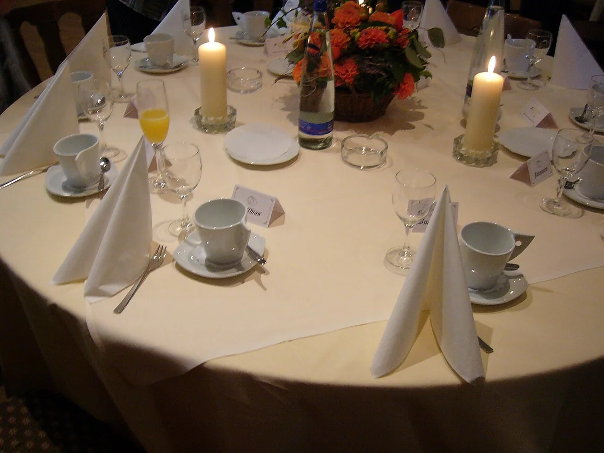
A round reception table set with folded napkins, candles and glassware. Photo: User:Mattes, Table setting during a German wedding party showing a simple example of decorative napkin folding 2006.jpg, Public domain. Resized and converted to WebP; the image remains available under its original licence. This is an illustrative photograph, not a Vowlinora case study or a photograph of the worked example.
