A wedding does not need a sign for every decorative idea. It needs clear information at the points where a guest has to make a decision. Start with the journey from arrival to seat, then decide which messages need physical signs and which can be handled by staff or a concise invitation note.
A beautiful welcome board cannot compensate for an unclear entrance. Likewise, a seating chart placed after the dining-room doorway may send guests backwards through incoming traffic. Location and wording deserve attention before typography and ornament.
➡️ Map the decision points
Walk the intended route with the venue. Identify entrances, turns, level changes, facilities and the point where guests need their table assignment. Keep official emergency and accessibility signage visible; decorative signs must not replace or contradict it.
- List each question a first-time visitor might ask.
- Choose the appropriate answer: sign, staff member, advance message or venue information.
- Write the shortest clear wording that answers that question.
- Place the message before the decision point.
- Check it from the likely approach direction and under relevant lighting.
- Ask the venue to approve placement and support equipment.
The HSE’s site-design guidance highlights circulation and avoiding pinch points. A sign should not encourage a crowd to stop in a narrow doorway. Ask where guests can pause to read without obstructing the approved route.
A worked arrival sequence
Assume an illustrative venue with two public entrances, a courtyard and an indoor reception room. The wedding uses the east entrance. A decorative board in the courtyard would look attractive, but visitors must choose an entrance before they can see it.
| Location | Guest question | Primary message |
|---|---|---|
| Before entrance choice | Am I going the right way? | Wedding reception — east entrance |
| Courtyard arrival | Have I arrived? | Welcome; event names and date |
| Before dining room | Where do I sit? | Find your name and table |
| At tables | Is this my table? | Clearly visible table identifier |
The first message is functional and should be visually dominant. The welcome board can carry personality, but essential directions should not be hidden inside a poem or long introduction. Use names and room labels consistently across the invitation, signs and staff brief.
Design for reading, not only photographing
W3C accessibility guidance recommends sufficient foreground-background contrast, clear headings and not relying on colour alone. Those are web-design principles rather than a physical-signage certification, but they are useful prompts for a printed draft.
Use words alongside arrows or symbols. If tables are colour-coded, also give them names or numbers. Choose a readable type treatment for essential information and reserve ornate lettering for short decorative elements. Print a sample at its intended scale rather than judging a zoomed-in screen preview.
Stand where guests will actually approach. Check glare, shadows and whether another person reading the board blocks the message. There is no single font size in this article that guarantees readability for every distance, material or guest.
Plan for changes and alternatives
Keep a simple replacement method for a room change, such as a venue-approved insert. Never improvise attachments to protected surfaces or move official signs. Outdoor supports and installation choices require the venue’s approval and suitable professional input where needed.
For guests who may need information in another format, offer a direct contact and discuss practical arrangements privately. A physical board should not be the only way someone can obtain their table assignment.
Before ordering, remove duplicated messages and check every name, room label and arrow. The useful takeaway is a coherent information trail: guests receive the right answer just before they need to act, while decorative details remain secondary to understanding.
Sources and further reading
Photograph credit
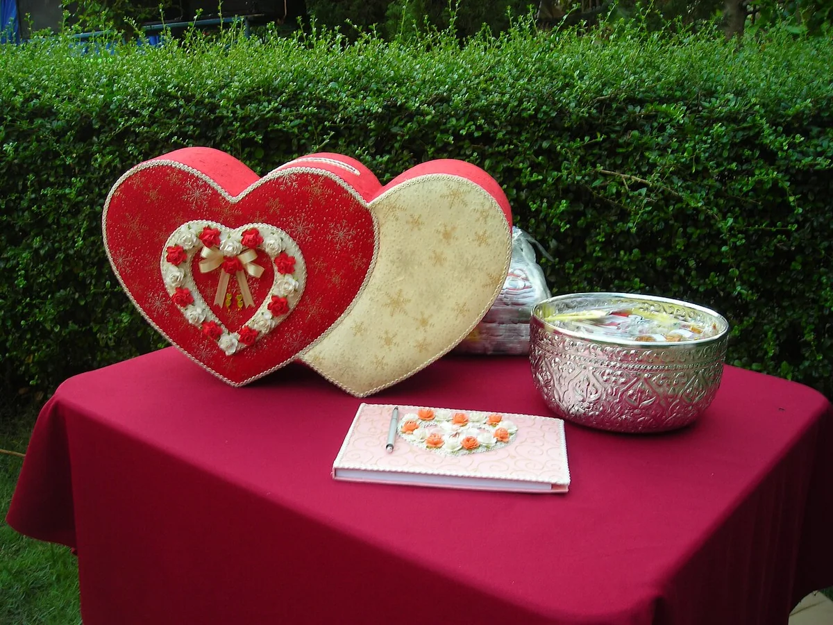
Heart-shaped decorative boxes on a red reception table in Thailand. Photo: User:Mattes, Marriage reception desk in Thailand.JPG, CC BY-SA 4.0. Resized and converted to WebP; the image remains available under its original licence. This is an illustrative photograph, not a Vowlinora case study or a photograph of the worked example.
