
An RSVP form can become an accidental questionnaire. Names, attendance and a meal choice gradually acquire travel histories, birthdays, relationship labels and open-ended questions nobody has a plan to use. Before adding another field, ask who needs the answer, what decision it changes and whether a guest has a comfortable alternative way to reply.
The W3C Web Accessibility Initiative recommends short forms that request only information needed for the process. Its guidance also calls for clear labels, helpful instructions and understandable confirmation or error messages. These are practical design principles for a wedding response form, not a guarantee that a particular platform meets every accessibility requirement.
📝 Give each field a job
| Field | Why it may belong | Safer design choice |
|---|---|---|
| Invited person’s name | Match the response to the guest list | Prepopulate known names where possible |
| Attendance | Plan places and service | Use clear attending or not attending options |
| Meal selection | Supply the caterer’s confirmed choices | Ask per attending person |
| Dietary or access discussion | Arrange a private follow-up | Offer a named contact rather than demanding a diagnosis |
| Contact information | Resolve changes | Request only a route you do not already have |
A song request may be enjoyable, but it should be optional and visibly separate from essential questions. Do not make a declining guest scroll through meal questions to submit a response. Avoid requesting passport details, medical records or a complete travel itinerary merely because the software offers those fields.
Test an illustrative response journey
Assume, for illustration, that one invitation covers Morgan, Alex and their child. The caterer needs individual meal choices, while the venue needs notice of access arrangements. The form first shows the three invited names, then asks attendance for each. Only attending guests see the meal choices. A separate optional field says: ‘If you would like to discuss dietary or access arrangements privately, contact Jamie at the address below.’
This design avoids a single household meal answer that leaves the caterer guessing. It also avoids forcing the child to provide a separate email address. If Alex needs to discuss a food allergy, the organiser can arrange direct communication with the caterer. The couple should not interpret a free-text note as confirmation that a kitchen can meet the request.
The confirmation page should summarise the actual response: ‘Morgan and Alex attending; Taylor not attending; two meal choices recorded.’ Include a clear method for correcting mistakes. A celebratory animation without a response summary may look polished while leaving someone unsure whether their answer was saved.
Build and check in sequence
- Confirm the caterer’s and venue’s genuine information requirements.
- Remove fields that do not lead to a defined planning action.
- Give every input a visible, meaningful label; do not rely on placeholder text.
- Try completing the form using only a keyboard and check the instructions on a small screen.
- Ask a trusted person to test an acceptance, a decline and a correction.
- Offer a phone, email or paper response route that reaches the same master list.
Keyboard testing is a useful check, not a full accessibility audit. If the platform makes labels, focus or error messages difficult to understand, consider a simpler tool. Do not assume a guest who uses an alternative route is less technically capable; privacy, connectivity and personal preference also matter.
Keep information proportionate after collection
Restrict access to detailed responses. A seating helper may need names and table numbers without needing private dietary discussions. Decide when administrative records will be deleted or reduced after the event, and check the platform’s storage and sharing settings. Applicable privacy law varies by jurisdiction and circumstances; this worksheet is not legal advice.
A successful RSVP system is not the one with the most fields. It is the one that produces an accurate answer, allows a correction and lets every guest respond without surrendering unnecessary information. Build for that outcome before choosing colours, illustrations or clever button text.
Sources and further reading
Photograph credit
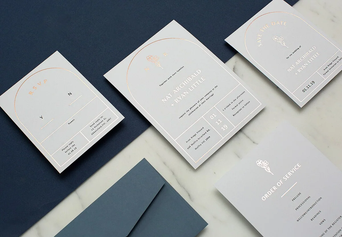
A coordinated pale wedding invitation suite arranged on a dark background. Photo: AlexBoston1, Rose Foil Invitation.jpg, CC BY-SA 4.0. Resized and converted to WebP; the image remains available under its original licence. This is an illustrative photograph, not a Vowlinora case study or a photograph of the worked example.
