A bilingual invitation is not simply an English invitation with extra lines squeezed underneath. It needs a reading order, an agreed relationship between the two versions and a way to confirm that both communicate the same event. Planning these decisions before design can prevent tiny type and costly last-minute corrections.
Start by identifying the languages your actual guests read, not the languages that look attractive in a reference image. Some households may prefer one language, others both. Names, venue addresses and formal expressions can require different treatment from ordinary sentences. Ask qualified language reviewers about those differences rather than assuming a literal translation is the fairest option.
🌍 Choose a layout before translating
| Layout | Useful when | Watch for |
|---|---|---|
| Side-by-side blocks | Both versions are similar in length | Narrow columns and competing reading directions |
| One language per side | You want generous type and spacing | Guests overlooking the reverse |
| Separate language editions | Households have clear preferences | Version control and sorting mistakes |
| Short printed invitation plus bilingual details | The schedule is complex | Essential information existing only behind a link |
Do not force equal line counts. A language may need more space to express the same meaning. Equal respect can mean different line breaks, suitable fonts and independent typographic adjustments, while retaining equivalent prominence for the couple’s names and the event details.
A fictional two-version production plan
Assume, illustratively, that a couple needs English and Arabic invitations for a ceremony and reception at one venue. They choose one language per side and identify each side clearly. Their translator supplies approved wording; a designer experienced with Arabic sets the text using appropriate fonts and direction settings. The couple does not manually reverse characters to make a screenshot look right.
W3C guidance explains that bidirectional text needs direction metadata and that plain-text controls have particular limits. This matters when an Arabic sentence includes a Latin-script venue name, telephone number or URL: punctuation and number placement can behave unexpectedly. The web guidance is not a print-production manual, but it identifies a real problem that should be checked in the actual design software and exported proof.
For this imaginary suite, the street address stays in the destination’s usable postal form, with an additional explanatory line if the reviewers recommend it. The couple tests the map link from both versions. They ask whether dates and times are unambiguous for their audience rather than assuming a numeric date such as 06/07 means the same thing everywhere.
Use a three-person check
- Create a factual master containing names, date, time, venue, address and reply deadline.
- Have a competent translator prepare the second version from that approved master.
- Ask an independent fluent reviewer to compare meaning, not merely spelling.
- Have the designer check font support, reading direction, punctuation and line breaks.
- Print a full-size proof and ask readers of each language to explain the event details back to you.
- Approve both versions together and lock their filenames to the same revision number.
Reviewers should see the final layout, not just a word-processing document. A correct accent can disappear in a font substitution; a line break can separate a title from the wrong name. Copying corrected text into a layout may also reintroduce an earlier error. Keep one named person responsible for incorporating changes.
Budget for language work, not only ink
Ask whether translation, specialist typesetting and independent proofreading are included in the stationer’s quote. Family assistance can be valuable, but do not assume relatives have professional editing skills or want responsibility for the final file. Give every reviewer a specific task and enough time to do it.
No single bilingual arrangement suits every combination of scripts, traditions or guest needs. If information must be shortened, remove decorative repetition before removing practical detail. The goal is that either language alone lets a guest understand the invitation confidently, with neither version treated as an ornamental afterthought.
Sources and further reading
Photograph credit
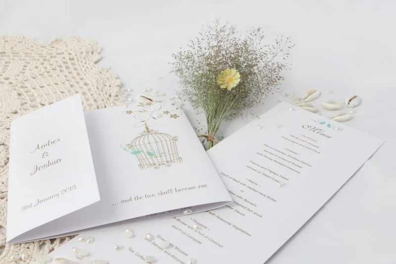
A white invitation suite styled with small flowers and decorative details. Photo: Belinda, DreamDay Invitations – Birdcage Wedding Invitations.jpg, CC BY 2.5. Resized and converted to WebP; the image remains available under its original licence. This is an illustrative photograph, not a Vowlinora case study or a photograph of the worked example.
